The Grand Lodge of Alaska is the next stop on the tour of American Grand Lodges.
 Alaska Masonic membership:
2,053 – 2006
2,003 – 2007
gain/loss – -50
data from MSANA
State population – 683,478 as of 2007 (estimated)
About the Grand Lodge:
On February 7, 1981, the MW Grand Lodge of F. & A.M. of Alaska opened its First Special Communication, its lodges having formerly been under the Grand Lodge of Washington.
Alaska Grand Lodge History
Vision statement:
Alaska Freemasons are a respected fraternity comprised of men with high moral character who make a positive difference in their community and the lives of their fellow man.
Mission statement:
The mission of the Grand Lodge of Alaska is to encourage and support the advancement of Freemasonry in Alaska by developing Masons who are assets in their communities
Alaska does not have a listing on Wikipedia.
One thing I do want to make note of is that Alaska is probably the youngest of Grand Lodges in the United States.
Some of what I found on my excursion there:
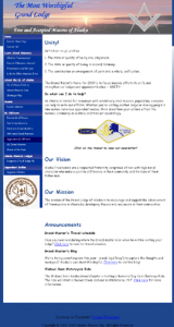
Opening the website, the user is met with a very clean two column layout. The top has an image of the Alaskan landscape with the sun at the horizon (which has an interesting symbolic aspect perhaps implying the sunrise in the east). Immediately on the page is a message from the Grand Master for 2009 about Unity. This site itself is built with an HTML architecture, where the navigation is straight forward on the left and the content resides in the larger well on the right. This is a frequently used architecture, because it is often the most straight-forward as clicking on the left side navigation the new content populates the right.
The navigation is text based which makes change easy to do on the fly, and it does employ a roll over change, so you know when the button is clickable. The only aspect that I found problematic at first was the differentiation between the heading for the site navigation and the links themselves, as both employed similar styled text. Also, several of the off links point directly to very large PDF and Word Docs, which when clicked proceed directly to be opened. This can be invasive as it is not giving the user the option of downloading it vs. it just opening on your browser. Also, not every user may have the program necessary to see the native document, creating additional confusion or loss of interest by the visitor.
From a navigation stand point, it seems that a missed opportunity here is to make each of the main areas: Home, Learn about Masonry, About the GL, Events, etc… into their own pages. That way, the content of the PDF could be laid into the page as text rather than a force to open/download file.
Informational Content:
When looking at the site from an informational stand point, I found that it was very robust, and all right at the top level of the navigation. It included aspects of Freemasonry and Religion, the Grand Lodge history, the Grand Officer line (including elected, affiliated, appointed, honorary, and past officer), and a list of “Masons of the Year”, and double list of state lodges by alpha and lodge number. It really covered its bases.
Also, it answers the 2be1ask1 question of how to become a Mason. Rather than employing the 2be1ask1 moniker, they come straight forward and have a link “How to Become a Mason”. Following the link sends you to a page with a link to a contact page; lodge connect page, and a “more info” link. As the prospect of the page started strong, it does lose the conversion appeal of the call to action (for more info!) immediately from that page rather it sends them out to another page with address, email and phone. This can be hard to change as it presumes that there is a mechanism in place to take in those contacts and manage them as they are received. This speaks to the broader organization (the back end of the site management) that necessitates some form of infrastructure to address any inquiries.
Look and Feel.
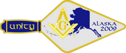
The Alaska Grand Lodge site is definitely informational driven and not based on art, which is fine. There were some good inclusions of artwork that highlight the state of Masonry in Alaska including the masthead, the state seal, the leadership, and the Grand Masters Trowel on the front page. Besides those hits, there was little use of art in the site. Where I did find the artwork was in the newsletter, which included a very generous application of fun images. I think that this was a great way to show off what the state of Alaskan Masonry was about. My only recommendation is to move the newsletter content out of the PDF, and into the website which makes it more accessible and user friendly. Why hide the photos of Masons on trips, in boats (or the goat with the saddle for that matter) when they show off what’s going on.
Overall:
The site is everything that a Grand Lodge website should be. The links work, and the content is spot on for what an interested Alaskan would want to know. Besides some off links to PDF’s and Word Doc’s, it tells the story that it needs to. My only real recommendation is to move the newsletter content out from the PDF and into the content of the site, because it would really go far to tell visitors what they are up to and what being an Alaskan Mason includes. I really like that the Grand masters message is on the front page right for the visitor to read as soon as they land, but it seems more crafted to the membership rather than the first time visitor, or non Mason who may have stumbled in from a Google search. There is information to be found, but it is mixed with who the message is meant for: the member vs. non member.
Coming up next – The Grand Lodge of Arizona.


No, I think that the youngest Grand Lodge is the new Grand Lodge of Southern New England, formed by the merger of the GLs of CT and RI.
Pretty lame website, though.
I see a story in the making there.
Greetings from Alaska!
Wish you saw Grand Lodge of Connecticut’s web site yesterday.
Simon, I have a screen capture of that 😉
I am 44 years old and live in MtPleasant Tennessee, I just joined a lodge, and are working my way up, I have been interested in moving up to the Wasilla area was just wondering about Lodges in the area.